Portfolio
Pre-Production
STORY
Zircon
(Protagonist) is a Lion hybrid, who lived in peace on his lush planet. Until
one day his planet was taken over by a breed of Hybrid Lizards that had been
waiting underground for the right to strike. Zircons now the last of his kind
has been locked away for centuries, until now. Zircon has broken free and is
now on the run, Escape is near.
Mood boards
Hero Mood Board
For
the Protagonist I was thinking of the big cat family. Also in it explains why I
went with a lion as the Protagonist. Also big cats are seen as strong and
powerful creatures which was one of the reasons I chose a Lion as the Hero.
Most Hero’s in game are seen as big and strong but in this case for my game I
wanted to play with that idea.

Enemy Mood Board
The
reason I went with Lizards is because generally most people hate Lizards and
see them as slimy and disgusting creatures. So with this in mind I created a
mood board inspired by lizards.

Background Mood Board
I
made this background mood board in order to find the right mood and setting for
the game. I wanted it to make sense with both the Protagonist and the
Antagonist. So it was believable that both could live in the setting of the
game. E.g. like a underwater background with a big T Rex in it would make
sense. So I want to make everything make sense.

Pixel Art Background

I
chose to make a pixel art background for reference for when I made my own for
the game. Due to the fact that I wanted to make my game strictly pixel art for
one reason which was that I really wanted to make a pixel art based endless
runner. So I made this mood board so I could refer back to if I need to. Also
the images I chose stood out to me because not only did they have a range of moods
and settings but they also had a range of pixel art style that appealed to me.
Silhouettes

These
were the only concepts I made due to time restriction but they showed a range
of different ideas I had for both the Protagonist and Antagonist. I wanted nice strong looking silhouettes for
the Protagonist and for the Antagonist I wanted to make silhouettes that
gestured sly and dangerous characteristic.
Rough Photoshop Sketch

This
was a quick sketch I made during class. It was just to see what one of the silhouettes
would look like if developed further. I used the purple colour scheme to show
royalty, like how the lion is the king of the Big Cats I wanted to show that
with this concept development. I thought it came out good so I kept this
concept for the Protagonist. The only thing I didn’t like was the feet. I added
Lizard claws as feet because originally I wanted the Protagonist to be a half
breed of lion and lizard but that didn’t make sense so I ditched that idea
.
.
Pixel Art Concept
OK so I made this concept Pixel Art to see how the concept I developed would look
in Pixel Art. Again I added the clawed feet as in the rough sketch which didn’t
turn out so well. Everything else looked OK though, I did change the feet later
on with the sprite development.
GAME ASSETS
Splash Screen
I
wanted the splash screen to pop out at the player so I kept that in mind and
made this image pop out from the black background which gave the effect of
Zircon breaking free from his prison. This was also done in pixel art which did
take me quite a while to complete. I used pixel art for this because my entire
theme was pixel art I did how ever think of making the splash screen in vector
but that would clash with all the other assets that were done in pixel art. I
also used this as the logo for the game too because it showed elements of what
the game was about, Escaping.
.png)
Background in Game
I
used reference from one of the images in the Pixel Art background Mood Board
for this image. I had to decide on whether or not it was going to be set at
night or day. But I thought most break outs happen at night so I stuck with a
pixel art night background. The image that I used as reference had a lot of
detail and tones that I wanted to add to my background. This helped make my
background stand out during game play which I liked. I also add other creatures
peering out from the forest to add more mystery to the background which worked
well. My only criticisms would have to shading. I could have shaded a few parts
of the trees and foliage to add more depth to the image so that it doesn’t look
as 2D.

Grass Plains
These
acted as boundaries within the game which worked very well. This image also
added to the Parallax scrolling effect, also I used this same image for the
foreground but just made it bigger so that I showed perspective. I got a lot of
motivation from old arcade games like Street Fighter, Metal Slug. Etc. that had
parallaxing backgrounds. The process for this was quite difficult because you
had to make different background layers and have them move at different speeds.
Then make sure that the speeds of each background layer looked believable.

Grass Plains Boarder
The
boarder added a nice touch to the game; it made the control menu look neater
and also kept with the theme of the game. I did intend to have the t boarders
as scrolling boarders but when I did it just look awkward and unnatural so I
decide to just have them as normal corner boarders.

Orbs: Attack and Shield
These
were the two power ups within the game that was motivated my Ninjump. I liked
the style Ninjump used for the power ups so I made my own that were similar to
the ones used in Ninjump.


Zircon Sprite
This
was the finalized product of the Protagonist within the game. I used Street
Fighter and Metal Slug as the main motivations for the development of this
sprite. I wanted to have the player feel connected to the Protagonist and I
think I showed this by the animation of the run. The process of making the running
animation was the movement because it was a running sprite I have to give the
effect of flow and also loop the run so that it cycled properly which took a
lot of time.


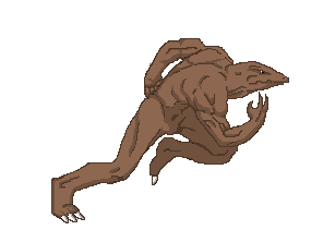
Enemy Sprite
This
was the finalized product of the Antagonist within the game. For this my main
motivation was Street Fighter. I liked how big and muscular the sprites were so
I used some reference from that and incorporated that into my own sprites. This
helped make the enemy sprites I made look more menacing and dangerous so that it
was clear to the player that this sprite was the enemy. The whole animation took quite long, this
animation has 10 frames in total and all where highly detailed because of all
the muscle the sprites had. Over all I think I came out well. My only Critic would
have to be the lack of highlights, if I had added those in then the enemy would
have more depth within the game and also help the player to understand the
light source.


Marketing Material
DOWNLOAD BUTTON

LOGO
POSTER FOR THE GAME

PROMOTIONAL BANNER

SCREEN SHOTS
SPLASH SCREEN

MAIN MENU

LOADING SCREEN

GAME PLAY
USING ORBS


