Sunday 24 November 2013

Modular EnvironmentBCT13021 - GA1A03
Modular Environment

So when we got the Modular environment Summative I immediately thought of a Sci fi run down environment or a destroyed space station. Since the environment and the particle effect assignments work in conjunction I had a lot to think about in terms of these thing working together. With that idea in mind it also gave me a thought of using particle effects such as sparks and smoke effect to make the scene come to life. I first started to look at run down environments like ancient ruins, space stations etc. I found these images quite useful but some just weren’t what I was looking for. What I was going for was kind of like an environment from the game Mass Effect produced by Bio Ware. So I searched images from the Mass Effect games which turned out great. A lot of useful references images came up and they were pretty much what I’d been hoping for. From there on I went and drew up a few blue prints as concepts for different layouts of the scene.
­­


As I starting building the pieces to my environment I came across a lot of issues such as making sure the pieces snap to grid, also making the corner piece they were the most challenging things to model. It took me a while to get these pieces together but I managed to get some help from fellow class mates who taught me a few tricks which helped a lot. When it came to the floor tiles I was thinking more about what texture to use more than anything, especially when we needed at least 4 texture variables.  There were also some issues where my pieces weren’t snapping to one another which caused a lot of problems and I was worried that I’d have to do everything again.  At one point I had miss read the Brief and didn’t create the window assets as separate piece which I then had to go back and build. This wasn’t that difficult but it was very time consuming having to start it again.

Using textures and finding textures that suit the theme of the environment wasn’t too difficult but in saying this I do having trouble with UV mapping and everything to, diffuse and specular maps. So I tried using a programme called Algorithmic Substance Designer. This programme is quite easy to use and very helpful.  Using the Sci Fi Mood Boards I complied I used that reference to find a suitable texture of my set pieces. There were some tiling issues with the textures that I had to go back and sort through making sure everything was tiling correctly, also going over my models making sure the UV’s are correct.

Here are a few Renders in Maya (WIP) at this stage:

 Three different wall textures
 Main Door
 Corner Piece
Hallway/Entrance

 Final 

So here are a few screen shots of the final product, it was a shame that I didn't have more time to make more models than the one required in the brief would have made the level so much better. But in saying that it turned out quite well, also I was having issues with the particle system in UDK so unfortunately I had to make the particle effect inside of Cry Engine. The particle effect is of a spark that was originally going to be placed by the doors giving the effect of them being breached or broken. But the environment in my opinion was a success. The reason I had to make these in different engines (the particle and environment) was due to some issues Cry Engine had with importing textures, so I had to build the environment using UDK. That was the only major issue with the importing side of things.

SCREENSHOTS


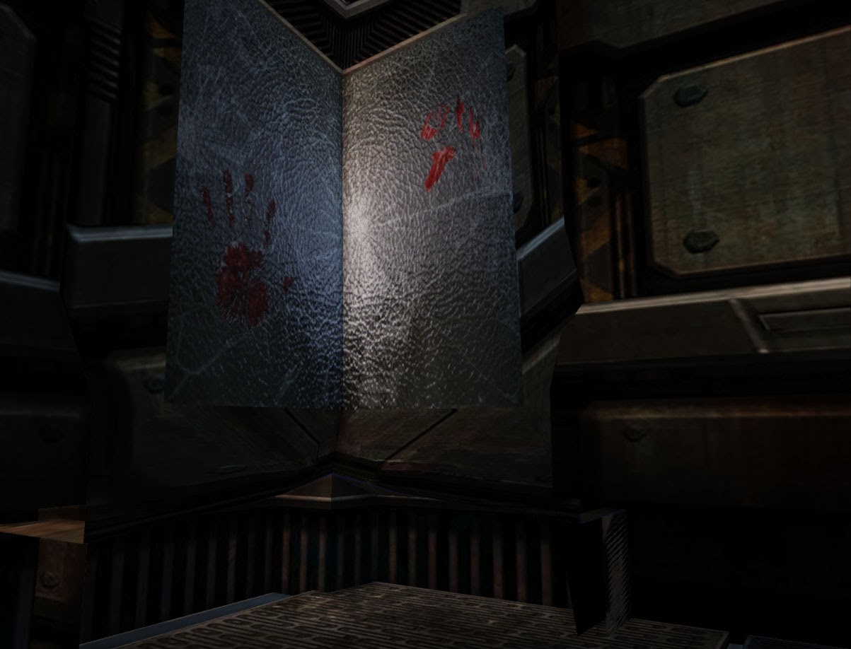
The level I built was more for an Interior level, not a lot of  outside viewing but I added some in there anyway.


PARTICLE EFFECT

This is the particle effect of a spark in Cry Engine, again sadly disappointed I couldn't solve those issues I was having but in the end i still made a good particle effect that would have looked amazing in the level.

Sunday 10 November 2013

GA1A01 Submission Four-Final Submission

The piece of work I have chosen to submit is a completely different medium than what I have done in the past. I thought a lot about what I was going to submit whether it was a drawing or a painting, in the end I thought a sculpture would be better to show my understanding of shape, form and anatomy. This Sculpture was done during a week-long lesson with Craig Campbell an amazing sculptor from Weta.

The lessons and information through life drawing has strengthened my understanding of anatomy throughout the year. In the piece you can see a clear understanding of structure in the face. The most challenging part of the process was the eyes, because they are so small it was hard to mold and form the dimensions of the eye. Also the eyes are what give a sculpture emotion and feeling; which put a lot of pressure on me to get the eyes perfect. Originally I wanted to make a human skull but the end product was something entirely different.  In the end I wanted to make something different so I decided to sculpt an Orc. I used a few reference images as a base for my sculpture and then drifted off into my own thing.  


Throughout the process of this year I have learnt more fundamentals of Traditional Art. This process has helped me understand more about composition, spacing, lighting, value, form etc. Now through going through this process of critiquing my own work I have developed a sense of artist analysis of my work. I now notice things that do and don’t work a lot more and it is quite shocking to how much I can point out within my own work. This process was a huge learning curb for me and something that I’ll continue to do in future art work.


Thursday 3 October 2013

BCT13021-GA1A03 ( 3D Asset Generator )


MedaBot Mood Board

For this assignment I was unsure what I would model, I went through a lot of different Pixel Art games and old school games that I had played such as Jazz Jackrabbit, Metal Slug etc. I then decided that I wanted to make a model of a robot but because I spent so much time thinking about what I was going to model I was unable to model anything that would be a High Resolution Model.
So I chose a Medabot to model for this assessment. The reason for this is that I used to play the Medabot game when I was younger and at that time it was also a TV show that I watched as well. Looking at the reference images I collected I thought that modeling this specific Medabot would be quite difficult and I wanted to see if I could pull it off.


Here is the model without any texture add to it. The process was quite difficult for me, to get an accurate model was most challenging. I ended up making a lot of different objects and then combining them together, Like the shoulder armor which was made out a cube then placed on top of another object. Also I had to do this with the Y shape on top of the head. 


   Was quite pleased with the end product. Really had trouble with the Spec Maps and Norm Maps. I was originally wanting to have the model look like a toy as the end product and I think I managed that. But in saying that there is a lot of room for improvements. There are a few tiling issue i could have improved on but again because I was so indecisive at the beginning of this project it set me back quite a lot and because of that i wasn't able to spend more time on them. I was quite happy with how the feet turned out even though they were the most annoying thing to model especially when it came down to the geometry. Over all this was a huge learning experience for me.

Obstacles

One of the hardest hurdles to get over was modelling the face of the model. I had no idea on how I was going to approach it. At first I used two different objects e.g. I got a cube and hollowed it out and shaped that to the frame work of the reference image. Then I used a sphere and up that into the hollowed out cube which then caused problems. Somehow I got that to work but then Maya crashed on me so all that was lost; saving is essential. So I tried again and just used the cube and as one object I shaped the framework to the models which was fairly easy.

The biggest Obstacle was the UV’s of the object because I had forgotten to delete some vertex‘s I had extra which made things a lot harder. So unfortunately I found this out half way through the process of sorting out my UV’s. This was a huge set back so with me having so little time I went through and weeded out as much of the extra vertex’s as I could. Due to this my UV’s didn't end up looking as clean as I would have like them to be.

There was also times where I had double faces but nothing that wasn't too hard to fix. A simple delete face and merge vertexes did the trick.


Thursday 12 September 2013

Theoretical Foundations of Art and Design
Life Drawing
Life Drawing 1

In this first piece you can see a good understanding of shape and form within the model. To achieve this i used the box technique which is lightly penciling box forms to show the gesture of the model. This also made it easier to show the weight within the piece which you can identify by the waist. I also achieved this using box forms which helped map out the planes that the hips where on giving more depth to the final product. This pose was 5 minutes, which isn't very long but in saying that i managed to get the solid gesture out of the pose. My criticisms would be that there isn't really any strong visible gesture lines within this piece, also there is hardly any visible line of action. This could have been improved on by gathering more information on the gesture of the model before adding harder lines maybe by using gestural lines as well of boxing out the form. Maybe include spherical forms as well. 


Life Drawing 2

In this piece i focused on the gesture more than anything. This piece was a one minute sketch and was meant to show our understanding of fluidity, gesture and movement within the model. There are visible gesture lines within this piece that helped capture the strong pose of the model. This was achieved my using a measurement technique were you hold the pencil up in front of you with one eye closed and from that using your pencil you can justify the distance of each part of the body e.g. the distance between the head and shoulders. From there you have to transfer that information onto a two dimensional plane (Paper). My Criticism would have to be on Proportion, the information in the legs are wrong and appear short. This could been developed more by finding the planes that the legs were on and then adding the gestural lines after which would of help measure the proportion giving me a better much strong pose. Also the head is on the wrong plane as well, almost looking two dimensional. Again this could have been developed by considering the perspective and measuring the distance between the chin and shoulder. 


Life Drawing 3

This piece was around 5 minutes, focusing on using box forms to find the gesture within the model.  You can see that using these box forms helped to identify the form of the muscle especially the oblique's. You get sense of the muscle wrapping around the model. This was achieved by using box forms to identify which planes the oblique's sat on. My critic would have to again be on the proportion of the piece. Again the legs, the left legs to too short and looks like the model has his leg elevated when it should be flat on the floor. Also the rendering of the piece is sketch which could have been worked on if a blending pencil was applied giving the piece depth.


Life Drawing 4

This was a quick 5 min sketch also focusing on box shape forms, weight and gesture. I focused on the hips of the model, trying to identify the weight shift within the hips. Also worked on trying to clearly show the gesture within this pose. In the second pose ( the smaller one) I focused on using box forms to identify the area where muscle would be under the skin so that when I comes to rendering I would know where the shadows would lay. My critics would have to be the hips in the first pose; they appear big making the model look feminine when it was a male model. This could be due to the fact that in focusing too much on the hips I may have exaggerated them. Using the measuring technique i could have measured the distance between the hips and transferred that information accordingly, ending up with better proportions.


Life Drawing 5

The session we were focusing on parts of the model. I chose the foot because personal I find that the hardest part of the body to draw. This sketch was close to three to five minutes long. I used box forms and spherical forms that are visible in this piece. The ankle was identified using spherical forms also the toes (phalanges). Box forms to used to identify the face of the foot which helped identify the shape. My critics would be that if I had more time I would have rendered the piece giving it more depth and life. Also this piece lacks movement, the angle of the ankle indicates slight movement but maybe through rendering and more detail i could have shown a stronger identification of movement within the foot.

Life Drawing 6

I also decided to focus on the hands of the model because like the feet I find hands quite hard to draw. To start i identified the line of action within each hand gesture from there i used box and spherical forms to find the shape of the hand ; identifying where the Carpals,  Metacarpals and Phalanges would be. After that lightly penciled in the shape of the hand and finally rendering to give depth. My critics would have to be that some of the hands have very strong line which doesn't make sense according with the light source making some of the pieces look stylized . Maybe going over and erasing some of the harder edges would have added more realism to the piece.


Thursday 11 July 2013

BCT13021A - GA1A02 2D Assest Generation

Portfolio

Pre-Production

STORY
Zircon (Protagonist) is a Lion hybrid, who lived in peace on his lush planet. Until one day his planet was taken over by a breed of Hybrid Lizards that had been waiting underground for the right to strike. Zircons now the last of his kind has been locked away for centuries, until now. Zircon has broken free and is now on the run, Escape is near.
Mood boards

Hero Mood Board
For the Protagonist I was thinking of the big cat family. Also in it explains why I went with a lion as the Protagonist. Also big cats are seen as strong and powerful creatures which was one of the reasons I chose a Lion as the Hero. Most Hero’s in game are seen as big and strong but in this case for my game I wanted to play with that idea.


Enemy Mood Board
The reason I went with Lizards is because generally most people hate Lizards and see them as slimy and disgusting creatures. So with this in mind I created a mood board inspired by lizards.


Background Mood Board
I made this background mood board in order to find the right mood and setting for the game. I wanted it to make sense with both the Protagonist and the Antagonist. So it was believable that both could live in the setting of the game. E.g. like a underwater background with a big T Rex in it would make sense. So I want to make everything make sense.


Pixel Art Background 
 

I chose to make a pixel art background for reference for when I made my own for the game. Due to the fact that I wanted to make my game strictly pixel art for one reason which was that I really wanted to make a pixel art based endless runner. So I made this mood board so I could refer back to if I need to. Also the images I chose stood out to me because not only did they have a range of moods and settings but they also had a range of pixel art style that appealed to me.

Silhouettes


These were the only concepts I made due to time restriction but they showed a range of different ideas I had for both the Protagonist and Antagonist.  I wanted nice strong looking silhouettes for the Protagonist and for the Antagonist I wanted to make silhouettes that gestured sly and dangerous characteristic.

Rough Photoshop Sketch


This was a quick sketch I made during class. It was just to see what one of the silhouettes would look like if developed further. I used the purple colour scheme to show royalty, like how the lion is the king of the Big Cats I wanted to show that with this concept development. I thought it came out good so I kept this concept for the Protagonist. The only thing I didn’t like was the feet. I added Lizard claws as feet because originally I wanted the Protagonist to be a half breed of lion and lizard but that didn’t make sense so I ditched that idea
.
Pixel Art Concept


OK so I made this concept Pixel Art to see how the concept I developed would look in Pixel Art. Again I added the clawed feet as in the rough sketch which didn’t turn out so well. Everything else looked OK though, I did change the feet later on with the sprite development.

GAME ASSETS

Splash Screen
I wanted the splash screen to pop out at the player so I kept that in mind and made this image pop out from the black background which gave the effect of Zircon breaking free from his prison. This was also done in pixel art which did take me quite a while to complete. I used pixel art for this because my entire theme was pixel art I did how ever think of making the splash screen in vector but that would clash with all the other assets that were done in pixel art. I also used this as the logo for the game too because it showed elements of what the game was about, Escaping.
Background in Game
I used reference from one of the images in the Pixel Art background Mood Board for this image. I had to decide on whether or not it was going to be set at night or day. But I thought most break outs happen at night so I stuck with a pixel art night background. The image that I used as reference had a lot of detail and tones that I wanted to add to my background. This helped make my background stand out during game play which I liked. I also add other creatures peering out from the forest to add more mystery to the background which worked well. My only criticisms would have to shading. I could have shaded a few parts of the trees and foliage to add more depth to the image so that it doesn’t look as 2D.


Grass Plains
These acted as boundaries within the game which worked very well. This image also added to the Parallax scrolling effect, also I used this same image for the foreground but just made it bigger so that I showed perspective. I got a lot of motivation from old arcade games like Street Fighter, Metal Slug. Etc. that had parallaxing backgrounds. The process for this was quite difficult because you had to make different background layers and have them move at different speeds. Then make sure that the speeds of each background layer looked believable.


Grass Plains Boarder
The boarder added a nice touch to the game; it made the control menu look neater and also kept with the theme of the game. I did intend to have the t boarders as scrolling boarders but when I did it just look awkward and unnatural so I decide to just have them as normal corner boarders.


Orbs: Attack and Shield
These were the two power ups within the game that was motivated my Ninjump. I liked the style Ninjump used for the power ups so I made my own that were similar to the ones used in Ninjump.


Zircon Sprite
This was the finalized product of the Protagonist within the game. I used Street Fighter and Metal Slug as the main motivations for the development of this sprite. I wanted to have the player feel connected to the Protagonist and I think I showed this by the animation of the run. The process of making the running animation was the movement because it was a running sprite I have to give the effect of flow and also loop the run so that it cycled properly which took a lot of time.


Enemy Sprite
This was the finalized product of the Antagonist within the game. For this my main motivation was Street Fighter. I liked how big and muscular the sprites were so I used some reference from that and incorporated that into my own sprites. This helped make the enemy sprites I made look more menacing and dangerous so that it was clear to the player that this sprite was the enemy.  The whole animation took quite long, this animation has 10 frames in total and all where highly detailed because of all the muscle the sprites had. Over all I think I came out well. My only Critic would have to be the lack of highlights, if I had added those in then the enemy would have more depth within the game and also help the player to understand the light source.


Marketing Material

DOWNLOAD BUTTON


LOGO


POSTER FOR THE GAME


PROMOTIONAL BANNER


SCREEN SHOTS
SPLASH SCREEN


MAIN MENU


LOADING SCREEN


GAME PLAY
USING ORBS